BigFood’s Price Gouging Exposed Again
For this Election Day around the country, this Tuesday, November 4, 2025, we need to look at what the politicians aren’t doing and take another good look.
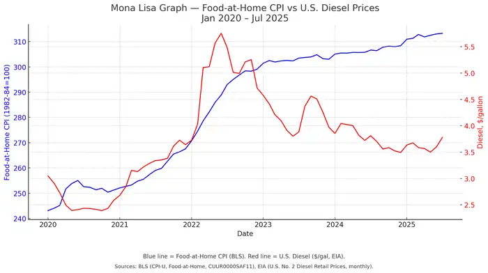
Look closely at the lines. One blue, one red. Together they form what we’ve come to call The Mona Lisa Graph — a quiet smile of data that hides a frown of truth. The blue line traces the Food-at-Home CPI, the government’s measure of grocery-store prices. The red tracks U.S. diesel fuel, the backbone cost of transport that every food distributor, manufacturer, and retailer swears determines what we pay at the register. But here’s the riddle: since mid-2022, diesel prices have dropped more than 35 percent … while food costs keep climbing.

Blue line = Food-at-Home CPI (BLS). Red line = U.S. Diesel $/gal (EIA). Data Jan 2020 – Jul 2025.
This isn’t a market correction. It’s a margin extraction — and the fingerprints are all over BigFood.
For the past two months, SpokenFood has been dissecting what we’ve called the Price Gouging Conspiracy, aka “WalletGate” — a coordinated silence among major producers, distributors, and retailers who continue inflating prices under the pretense of “supply-chain recovery.” In truth, their supply chains recovered long ago. Corporate earnings tell the story: record profits at packaged-food giants, record margins at grocery conglomerates, and quarterly statements that celebrate “pricing power” as though it were a virtue rather than a vice.
The Mona Lisa Graph lays that story bare. When diesel spiked in 2022, food prices followed — a reasonable response to fuel costs rising above $5 a gallon. But when those fuel costs fell back to ~$3.50 and held steady for nearly two years, the expected rollback in food prices never came. Instead, the line representing groceries climbed higher still, each month another quiet transfer of wealth from shoppers’ wallets to executive bonus pools. The EIA and BLS data make it plain: transportation costs no longer justify what you’re paying for bread, milk, or cereal. What justifies it is greed.
We’ve called out the usual suspects: the national grocery chains that set “zone pricing” to wring extra pennies from rural shoppers; the distributors that double-dip on fuel surcharges even when their own fleet costs fall; and the corporate PR departments that blame “input volatility” while simultaneously approving record share buybacks. If the public saw these ledgers side-by-side, the outrage would be deafening. Instead, they see slogans about “supporting farmers” and “stabilizing supply.” The only thing stabilized is profit.
Here’s the irony: fuel and food once moved in lockstep — a natural dance between harvest, haul, and home table. But now, as the Mona Lisa Graph shows, that relationship has broken. The blue line ascends steadily even as the red line deflates, an artistic inversion that economists might call “price stickiness” but consumers rightly call “getting played.” When fuel costs half of what it did two years ago yet groceries cost 15 percent more, the invisible hand looks a lot more like a closed fist.
So today’s reminder isn’t just about data — it’s about accountability. Every shopper in America has lived this chart without ever seeing it. SpokenFood will keep publishing these numbers, these lines, these proofs, until regulators stop accepting corporate talking points as economic law. This isn’t about partisanship; it’s about arithmetic. Fuel down. Costs down. Prices should be down. They’re not. And that’s not an accident — it’s policy by profit. Stand by for our Reels vid, coming on Facebook and YouTube soon.
BigFood’s smile may look subtle, but like the Mona Lisa herself, it follows you around the room. The longer you stare, the more you see. 👁️🗨️
Sources: Bureau of Labor Statistics (BLS, CPI-U Food-at-Home CUUR0000SAF11) and U.S. Energy Information Administration (EIA No. 2 Diesel Retail Prices). Analysis by SpokenFood.com.
